QA: Powering Potential

Smiling woman with dark hair and earrings on a teal background with a large white rightward arrow pointing towards her.

Finding the human heart
in a world of tech


QA is the UK’s leading training provider, with over 2,100 employees and clients including Google, Microsoft and Oracle. Its world is technology, a stark contrast to its inspirational training programmes, and its brand was ‘dull, corporate and disjointed’. We cut through the complexity to find a simple, robust idea: the true


value at the heart of QA is human -
the power to change lives and fulfil potential. The new positioning and identity changed how QA is seen, inside and out. In QA’s words, it ‘makes us proud’ and ‘has changed the way we do business’. We’ll take that!
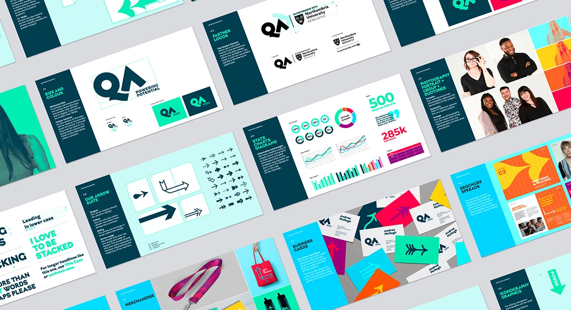
A layout of multiple pages showing brand guidelines, including logo usage, typography, charts, arrow icons, photography of people, and promotional merchandise with bright colors and modern design elements.
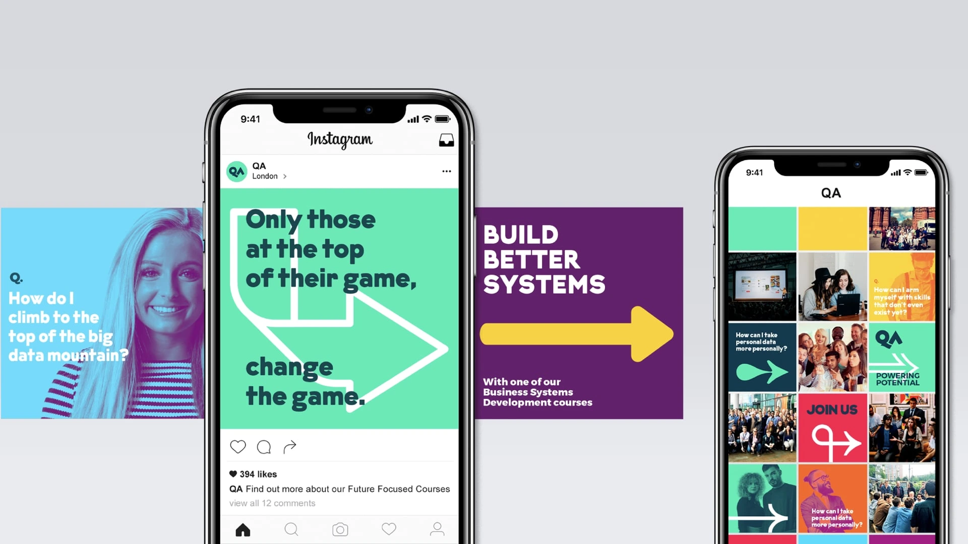
Two smartphones display Instagram content: the left phone shows a post with a large arrow and the text 'Only those at the top of their game, change the game.' and a part of an image of a smiling woman with the question 'How do I climb to the top of the big data mountain?'; the right phone shows a grid of colorful images and text including questions about personal data and skills, the QA logo, and a call to 'Join Us.' A purple banner between the phones says 'Build Better Systems' with an arrow, promoting Business Systems Development courses.
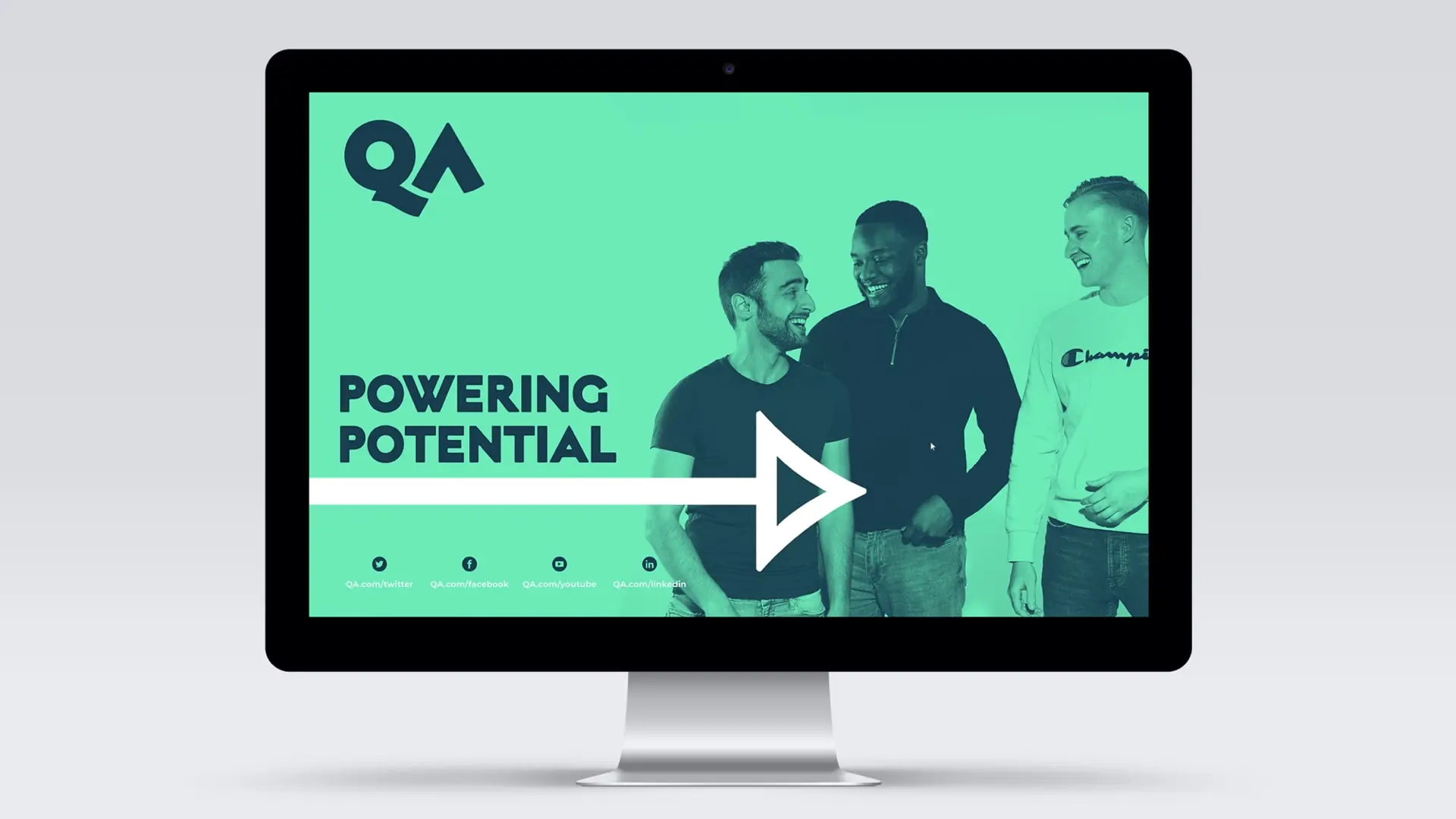
Computer monitor displaying three smiling men standing together on a green background, with the words 'Powering Potential' and a large white arrow pointing right, along with social media icons and links below.
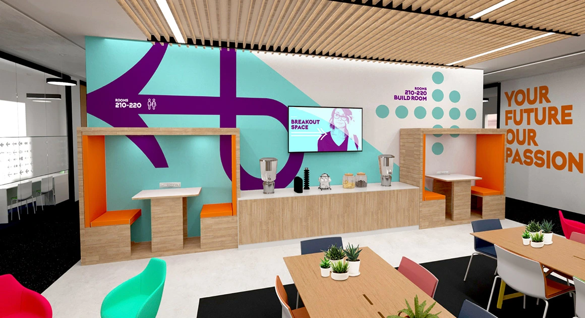
Modern breakout space with wooden tables, orange cushioned booth seating, and colorful chairs around tables with small plants. The back wall has turquoise and purple directional arrows and text indicating rooms 210-220 and a Build Room, with a screen displaying 'Breakout Space'. The right wall features orange text reading 'YOUR FUTURE OUR PASSION'. The ceiling has wooden slats with recessed lighting.
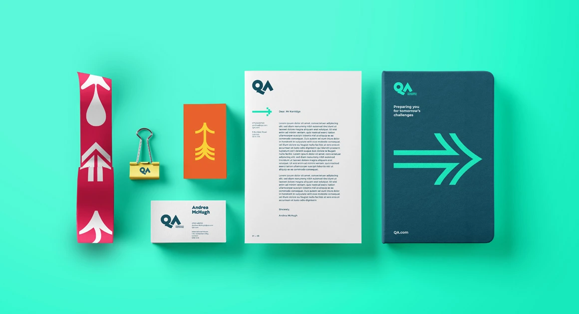
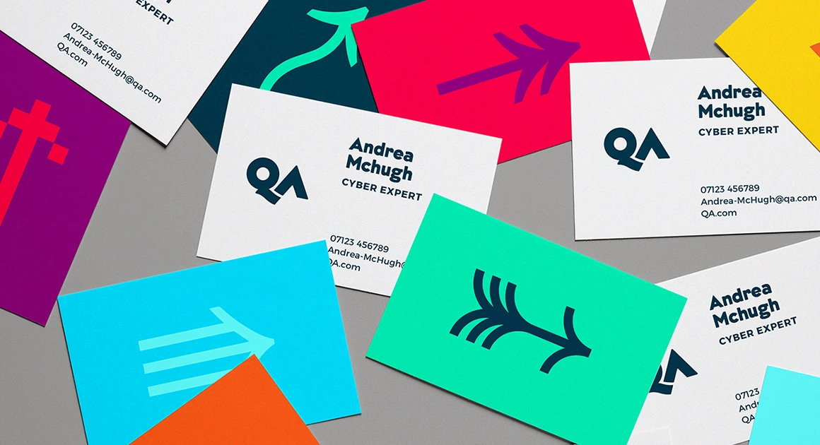
A flat lay of branded office stationery on turquoise background, including a red ribbon with white arrow designs, a yellow QA-branded binder clip, an orange card with a yellow arrow design, a white business card for Andrea McHugh with QA logo, a letter with QA logo and placeholder text addressed to Mr. Kerridge, and a dark teal notebook with QA logo, the phrase 'Preparing you for tomorrow's challenges,' a large turquoise arrow graphic, and QA.com at the bottom.

See Projects

Beefeater: London's Spirit

Strategy
Activation
Brand World
Brand Identity
See Project

Jameson: Makers Series

Activation
Experiences
Strategy
See Project