

Beefeater: London's Spirit
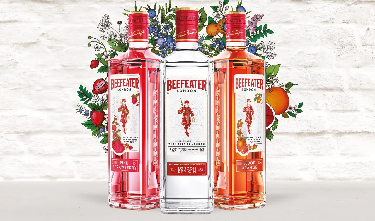
A brand world for a
world of new flavours
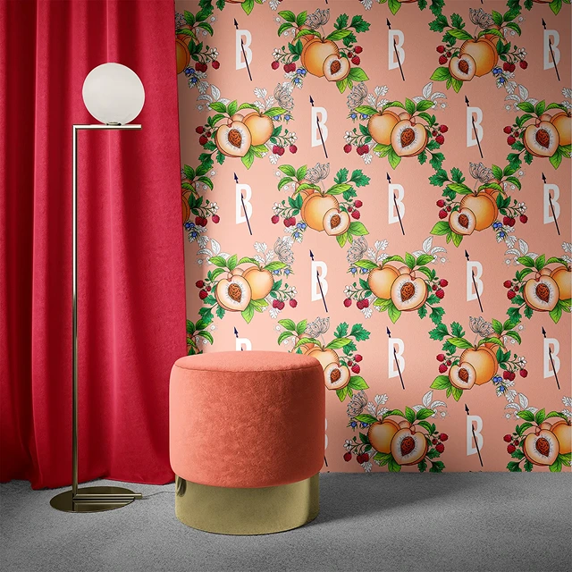
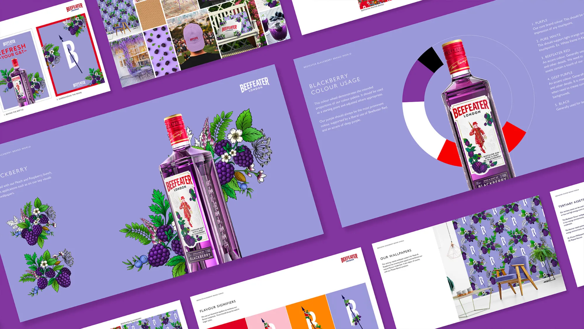
We distilled 200 years of London heritage into a new ‘Spirit of London’ positioning and brought it to life in a new masterbrand world that keeps the brand’s British heritage and captures London as it is today. Every element nods to urban life. We used the ‘London brick’ as a distinctive asset (it’s an icon, after all), updated the typeface and colour palette, and created a new illustration style to modernise the
brand. Distinctive icons and assets help it show up recognisably in dark markets and flex across new flavour launches. For each new flavour, we created a brand world rooted in the masterbrand, with full guidelines and a 360° toolkit that drives distinctiveness and consistency across markets, channels and touchpoints.











We're a Ruder Finn Company
Stay connected

