
Crodino: Open Sunshine

A big, bright idea for a sunnier global outlook
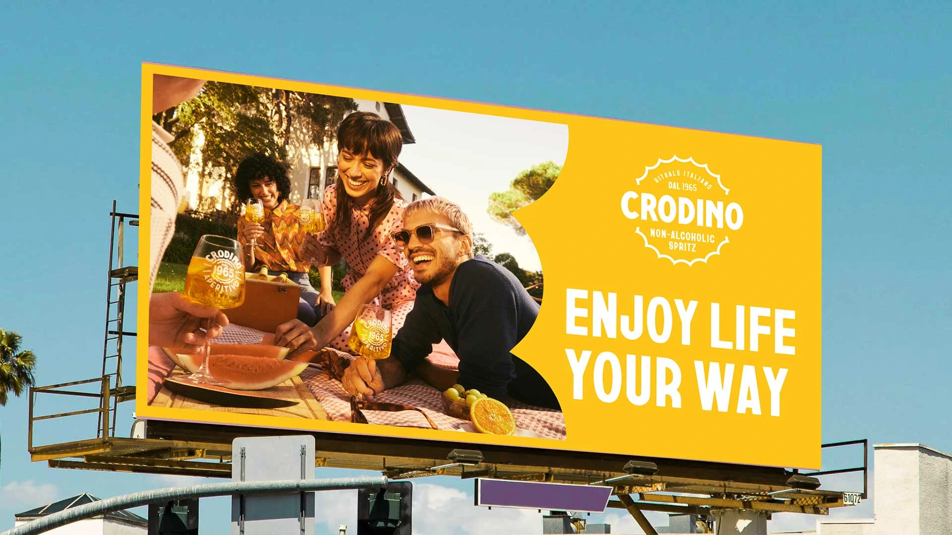
Crodino is a classic Italian non-alcoholic aperitivo launched in 1065, with a secret recipe that’s never changed. Well known at home but little known elsewhere, and with real heritage unusual in its category, owner Campari Group wants to make Crodino the world's no.1, but Crodino needed a new identity to appeal to Gen Z and fuel global growth. Today’s young consumers live in a complex world and want respite from doom and gloom; we saw an opportuniuty for Crodino to be the provider of little moments of joy. The ‘Open Sunshine’ creative platform builds on Crodino’s existing brand assets and personality, with a hint of 70s feel-good vibe, leaning into positivity and letting in the light.

The bottle top brings out the sun
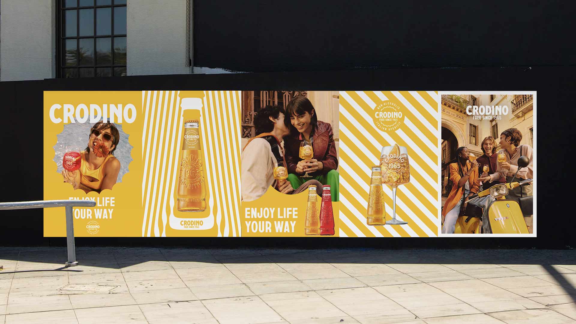
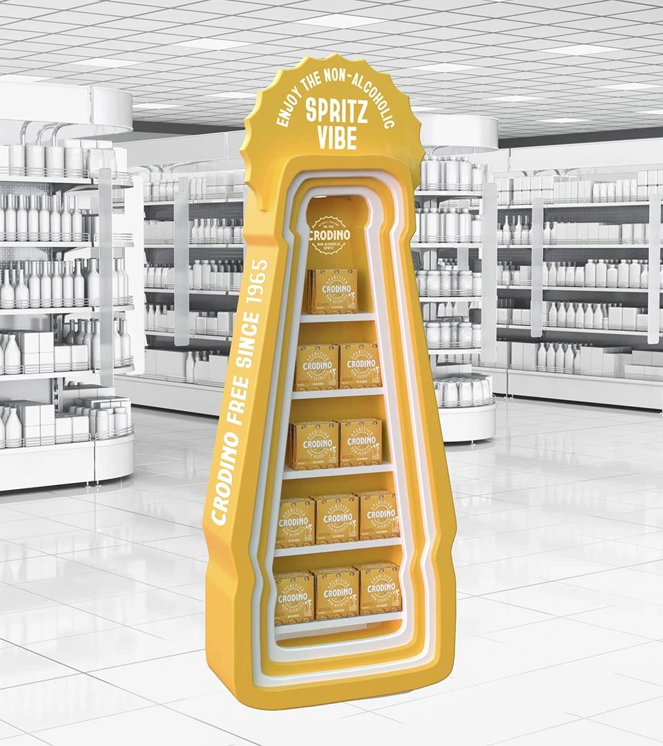
At the heart of the brand world is the bottle top. We picked out its iconic shape and repurposed it as a sun motif, quite literally bringing the energy of summer to every touchpoint, from POS to photography. Colliding different font weights and styles, we created a playful typographic style inspired by retro Italian signage.
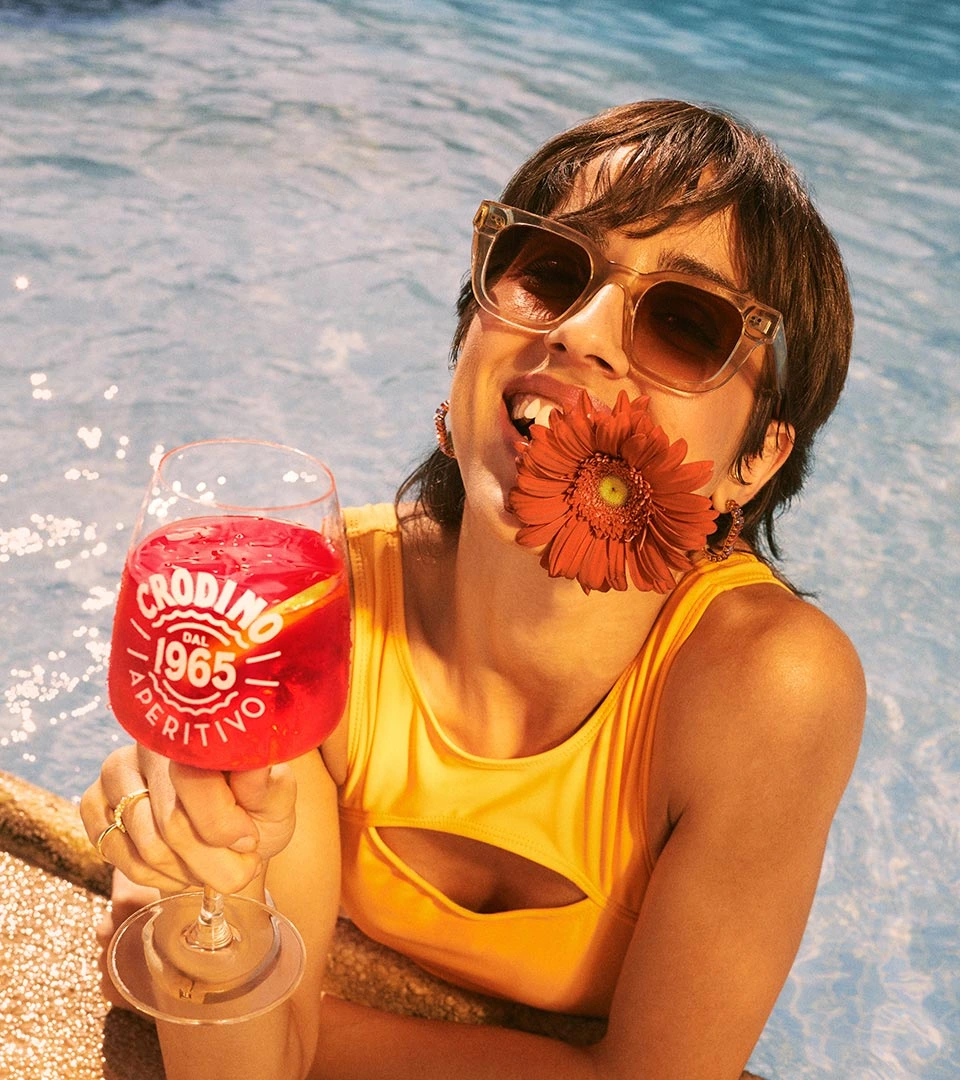
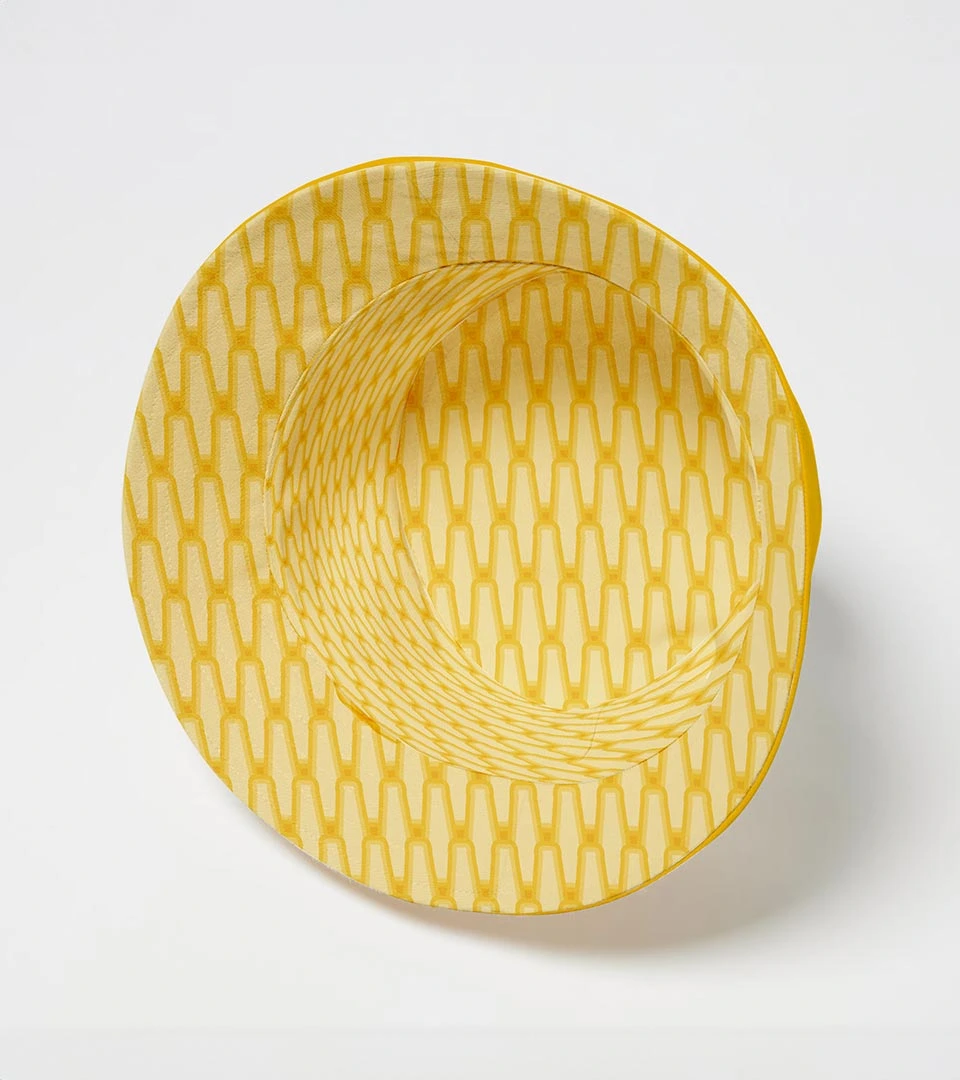
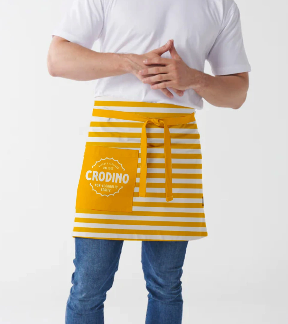
Bold, repetitive patterns, drawn from parasol stripes and redrawn in the Crodino bottle shape, cue an iconic era of Italian design. Sun-bleached, golden-hour photography in Crodino’s signature yellow completes the look, bringing the gentle humour and innate Italian style of the brand to life.


Urban oases and sunnier shelves
Open Sunshine was built to travel. Activations turn urban spaces into bright, summery hangouts, encouraging people to break from the everyday. Our ‘Liquid to Lips’ activations took the idea across Europe with Chiosco Crodino, a bright yellow pop-up introducing new drinkers to the Crodino ritual. We also tailored the identity for Italy, keeping tradition at its heart. The new look has boosted shelf standout, and in the year of launch Crodino saw a 19% sales uplift across EMEA (excluding Italy). Crodino has since launched in the US and Greece, and relaunched in the UK.


Silver: Crodino BVI and Brand World

Best Visual Identity from the Food & Beverage Sector Silver: Crodino